User Guide: Using Console
This page is the view-by-view reference for the Logster console. Each section explains what the view shows, where the numbers come from, and how to read them during an investigation.
Summary
The top of the console is a row of KPI tiles computed over the inference results in the selected time range. Each tile is a single straightforward aggregation — a count, average, max, or unique-count metric.
| Tile | What it means |
|---|---|
| Active endpoints | Unique endpoints that produced at least one inference in the window. |
| Total inferences | How many inference runs completed in the time range. |
| Total attacks | Of those, how many came back with prediction == "attack". |
| Total benign | The benign count. total = attacks + benign + errors. |
| Avg attack probability | Average attack_prob across every inference. |
| Max attack probability | Peak attack_prob. Rising max is the strongest early signal of a live attack. |
| Avg inference time (ms) | Health signal. A sudden jump means inference is under load. |
Model confidence and probability percentiles are not repeated here — they live in the Detection Insights card, which is the single home for model-health numbers.
How to read it
- If total attacks > 0 in a
now-30mwindow, that's what you investigate next. Jump to Hosts or Recent Attacks. - If max attack probability is near 1.0 but total attacks is zero, the threshold is too high for that run — rare.
- If avg inference time is spiking while active endpoints is stable, the
fleet is getting noisier per host — tune
inference.window/inference.interval.

Summary KPI row — seven tiles over the selected time range. "Attacks Detected" and "Max Attack Probability" are the two tiles analysts read first.
Filters
Two controls in the top bar scope every panel on the page.
Time range. Pick a preset ("Last 30 minutes"), build a relative window ("Last 45 minutes ago"), or pin an absolute start and end on the Absolute tab. Absolute ranges are the ones to use mid-investigation: auto-refresh keeps polling, but the window stays fixed on the instants you chose instead of sliding forward. The picker remembers your recent ranges, and the selected range survives a page reload. Histogram bucket width is chosen from the span, so a custom range gets sensible resolution automatically.
Endpoint. A search box rather than a list. Type a fragment and the server
returns matching endpoint names — win and *win both match WIN-DC01 and
srv-win-03, case-insensitively; ? matches a single character. Results are
always capped, so this stays fast on fleets with thousands of endpoints. Leave
it empty (or use the ✕) for all endpoints.
Both filters apply to every panel, including the alert feed and the distribution charts.
Hosts
A card per endpoint. Each card shows:
- Hostname
- Total inferences in the time range
- Attack count — how many inferences came back as attack
- Average / maximum attack probability
- Latest activity timestamp
How to read it
Sort mentally by max attack probability first, then by attack
count. A host with max_prob = 0.97 and attack_count = 2 is
almost always a better first stop than one with max_prob = 0.75
and attack_count = 40.
Cards are color-coded by severity on the UI side. The color mapping follows the same thresholds as the alerts service:
| Color / label | max_prob |
|---|---|
| CRITICAL | >= 0.95 |
| HIGH | >= 0.85 |
| MEDIUM | >= 0.70 |
| LOW | < 0.70 |
Clicking a card sets the hostname filter for every other tile in the console.
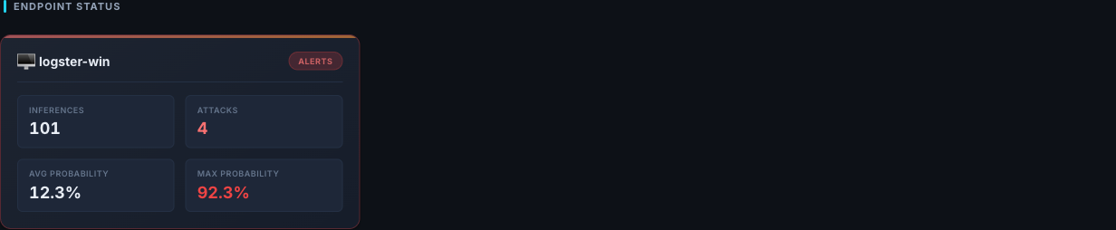
Endpoint Status — one card per host. Header banner turns to "Alerts" when attacks are detected; the four tiles (Inferences, Attacks, Avg / Max Probability) let you sort mentally by worst-first.
Attack Timeline
A bucketed date histogram over inferences. Each bucket carries four metrics:
attack_count— inferences withprediction == "attack"benign_countavg_attack_probabilitymax_attack_probability
How to read it
- A flat benign line punctuated by a single attack spike = isolated suspicious window. Investigate that one bucket.
- A rising
avg_attack_probabilityover several consecutive buckets = a multi-step attack that the detection model is finding more incriminating over time. This is the "live incident" pattern. - A big
maxbut a lowavg= one loud window inside a quiet hour. Likely a short burst — PowerShell, lateral login, a scheduled task firing.
The timeline respects both the time range and the hostname filter, so you can scope it to a single host and see its activity at 1-minute resolution.
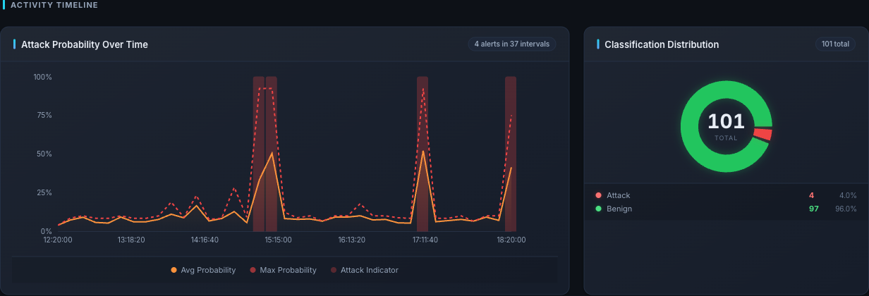
Activity Timeline — avg / max attack probability line plus the red "attack indicator" bars at each spike. The right panel shows attack vs benign split for the same time range.
Recent Attacks
A sorted list of the most recent inferences where
prediction == "attack", newest first, inside the current time range.
Each row contains the full inference document: inference_id,
endpoint_id, attack_prob, confidence, ttp_techniques,
and event_ids.
Rows are the entry point for the Inference Detail view — clicking one opens the drill-down.
The Alert Feed in the left sidebar shows the same inferences as cards. Each card leads with the ATT&CK name of the primary technique the classifier cited (for example Command and Scripting Interpreter: PowerShell) rather than a bare technique ID, followed by the endpoint, the full date and time, the attack probability, the technique chips, and the model's rationale. Hover a chip for the technique's ATT&CK name.
The Inference Log opens with Attacks Only already ticked — the benign population is orders of magnitude larger and would otherwise push real detections off the first page. Untick it to see every scored window; the choice is remembered.
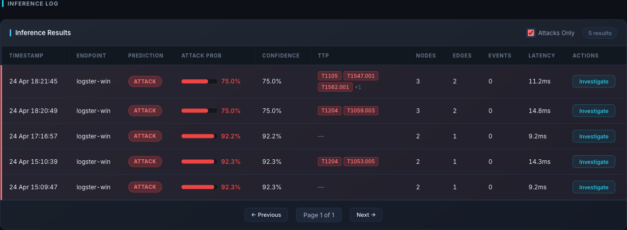
Inference Log with "Attacks Only" checked (the default) — this is the "Recent Attacks" view. Each row carries the TTP chips and the Investigate button that opens the Inference Detail modal.
Inference Detail
The single most important investigation view. Given an inference_id,
it returns:
- The full inference record — prediction, attack probability, confidence, threshold, window start/end, model name, TTP techniques.
- Every normalized event that contributed to that window, sorted
by timestamp. For each event:
event_type,image,command_line,parent_image,parent_command_line,user,hashes, and (for file events)target_filename.
How to read it
This is where you answer the question: "What is the model actually looking at that makes it think this is an attack?"
- Start with the window time range. That's the 3-minute slice (by default) the detection model used.
- Scan the event list top-to-bottom and look for one of the classic
shapes:
powershell.exewith an-enc/ base64 argumentwmic/schtasks/at.exespawning under an unusual parent- LOLBins spawned by
winword.exe,excel.exe,outlook.exe whoami/net user/net groupright after a user logon- File writes into
C:\Users\Public\,%TEMP%\, or system dirs
- Match what you see against the
ttp_techniquesfield — it's the short-form story of what Logster thinks happened.
[!NOTE] If the event list is empty or very small, the detection model ran on a nearly-empty window. Those are the inferences that usually come back as
errorrather than useful verdicts — ignore them for triage and investigate ingestion gaps instead.
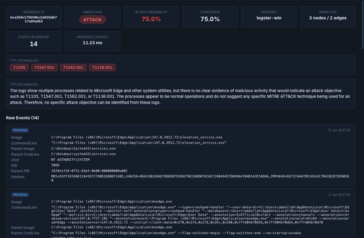
Inference Investigation modal — metadata tiles across the top, the MITRE TTP chips, a natural-language TTP explanation, and the scrollable Normalised Events list below.
Process Tree
Takes the same inference_id and reconstructs a flat process timeline
from every contributing event: pid, ppid, image, command_line,
parent_image, user, and timestamp. The UI renders it as a tree
anchored on parent/child relationships.
How to read it
Walk the tree from the root down. Most real attacks show one of two patterns:
- LOLBin chain:
explorer.exe → cmd.exe → powershell.exe -enc ...orwinword.exe → cmd.exe → mshta.exe. - Service abuse:
services.exe → svchost.exe → <something unexpected>.
If the parent of a suspicious process is itself suspicious, keep
walking up. If the parent is explorer.exe or services.exe, you
have probably found the initial execution.
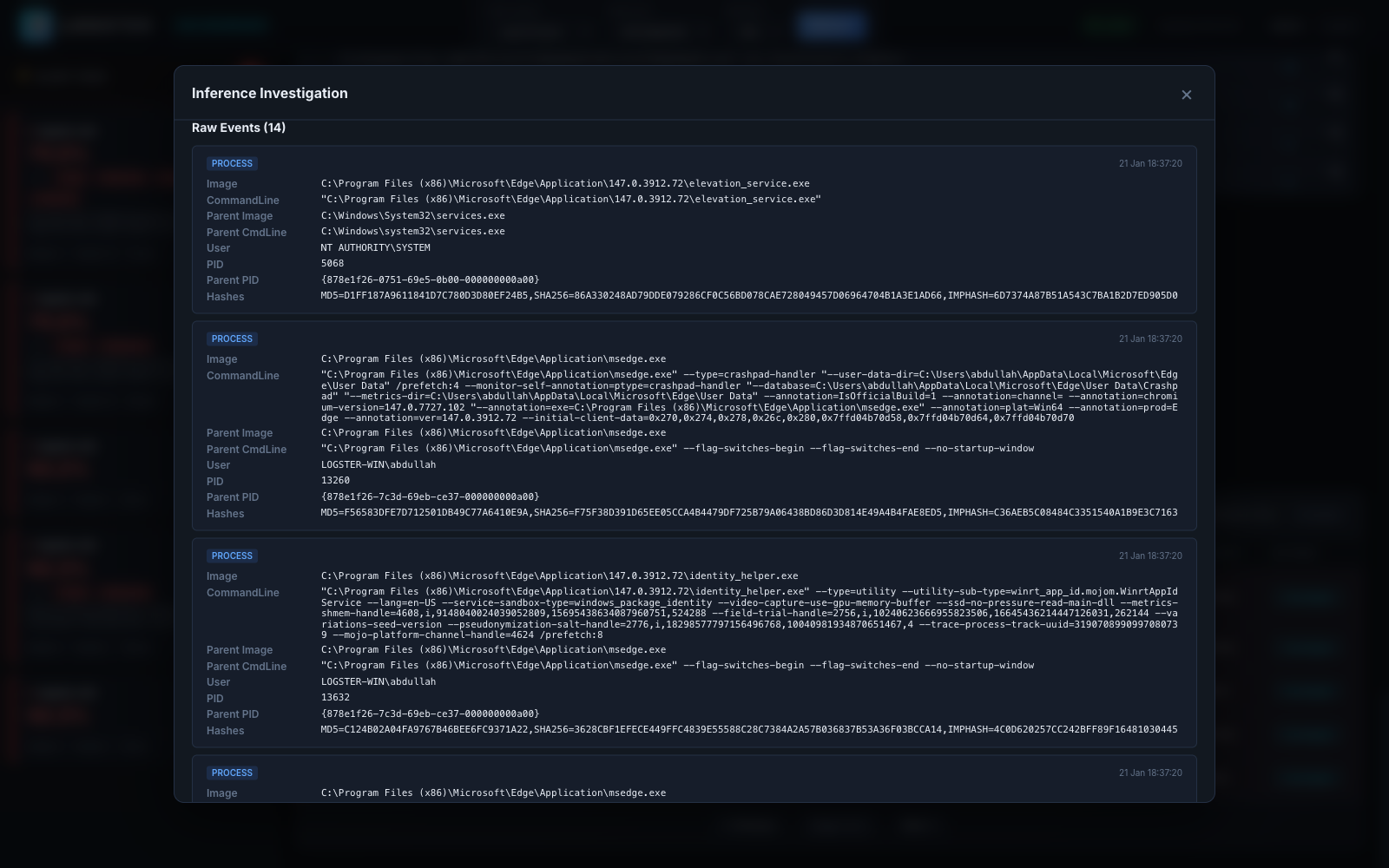
Normalised Events inside the modal — each process card carries Image / Parent Image / Parent CmdLine / PID / Parent PID. Walk parent→child by matching Parent PID to PID of an earlier card. The current console renders the parent/child chain inline in this list rather than as a separate tree graph; the parent/child chain is rendered inline in this list.
Endpoint Insights
A set of panels computed from the events index rather than inferences, so they describe raw host behavior regardless of model opinion. Use them to build a baseline.
| Panel | Endpoint | What it answers |
|---|---|---|
| Event volume over time | /insights/event-volume |
How noisy is this host right now? |
| User activity | /insights/user-activity |
Who is actually doing things on this host? |
| File activity | /insights/file-activity |
Which files are being touched most? |
| Network destinations | /insights/network-destinations |
Where is this host talking to (externally)? |
Two of these panels filter noise by default, and say so under the chart when they do:
- User activity hides built-in service identities —
SYSTEM,LOCAL SERVICE,NETWORK SERVICE,DWM-*/UMFD-*, machine accounts (HOST$), and the Unix daemon accounts.rootis not hidden. - Network destinations hides addresses that are not routable external destinations: loopback, RFC 1918 and CGNAT ranges, link-local, multicast, broadcast, and the IPv6 equivalents. Per-destination ports moved into the bar tooltip.
All insight panels accept a platform query parameter (windows,
linux, or all). The Linux branch uses Painless runtime mappings
to fish fields out of raw auditd/eBPF records — you don't have to
think about this as an analyst; the same panel works across both
platforms.
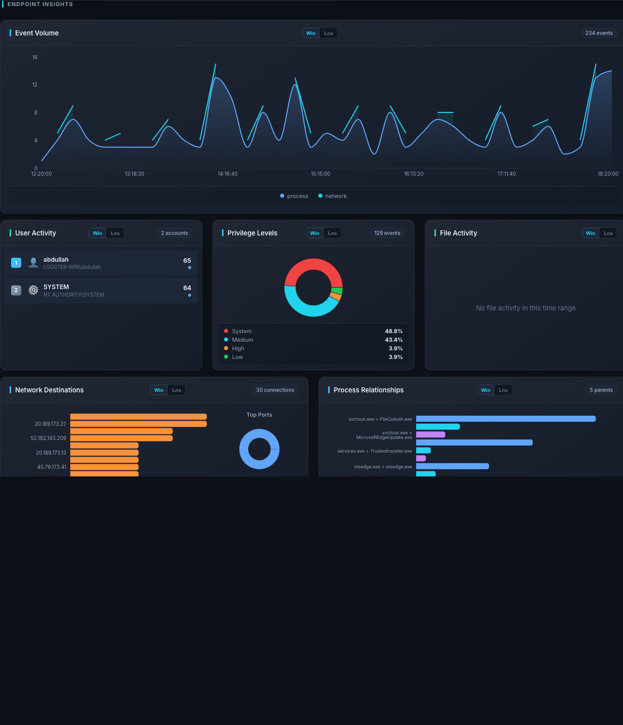
Endpoint Insights — Event Volume across the time range, then per-host baselines: who's active (User Activity), which files are being touched (File Activity), and where the host is talking to (Network Destinations).
Distribution — where is the noise coming from?
Two aggregations that answer different questions:
predictions— how manyattack,benign, anderrorverdicts in the time range. A higherrorcount means the inference service is feeding the detection model bad or undersized windows.host_attacks— per-hosttotalvsattacks. Lets you see which host is the biggest attack-generator.
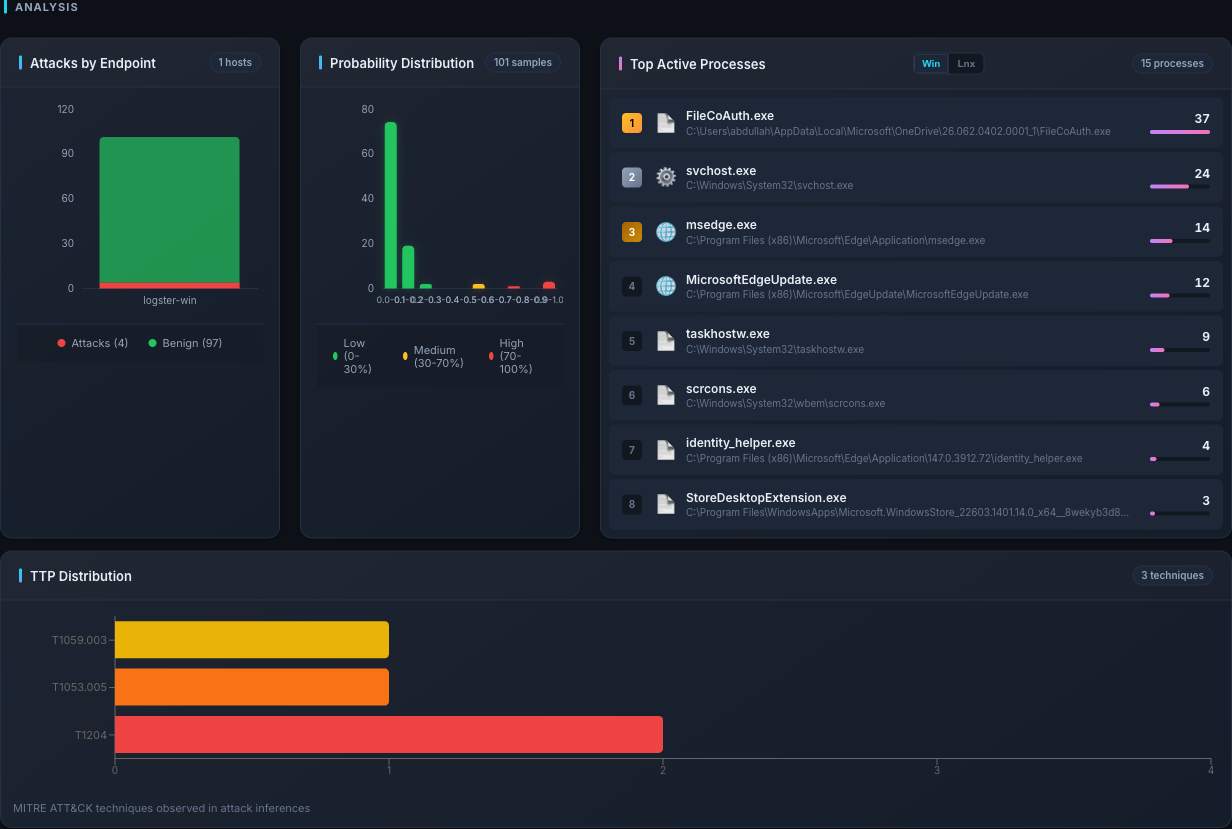
Analysis — Attacks by Endpoint shows the per-host attack / benign split; Top Known Processes and TTP Distribution round out the noise picture.
Top Known Processes excludes operating-system service noise (svchost.exe,
csrss.exe, systemd, kernel worker threads, and the Logster collectors
themselves) so the ranking reflects what actually ran rather than what the OS
always runs. The count of excluded binaries is shown under the list.
TTP Distribution rolls sub-techniques up into their parent — T1548.001
and T1548.002 both count towards T1548. Hover a bar for the technique's
ATT&CK name and the sub-technique breakdown.
Analytics
A cluster of deeper views.
| Endpoint | What it answers |
|---|---|
/analytics/trend |
How does the current period compare to the previous period? (up / down / stable based on ±5%.) |
/analytics/event-types |
Event type breakdown (process / file / network / script / syscall). |
/analytics/top-processes |
Most-seen process images and their parents. |
/analytics/endpoint-platforms |
Which endpoints reported Windows vs Linux events. |
/analytics/heatmap |
Day-of-week × hour heatmap for attack inferences. |
/analytics/threat-metrics |
Derived threatScore / threatLevel plus severity buckets and probability percentiles. |
/analytics/ttp-distribution |
Top MITRE ATT&CK techniques across attacks. |
/analytics/attack-timeline |
Bucketed attack history with per-bucket avg / max / high-severity counts. |
The two most valuable tiles during an active investigation are Trend (is the attack rate rising?) and TTP distribution (which techniques dominate right now?).
[!NOTE] The console's threat score is a simple composite —
0.4 * attack_rate + 0.3 * avg_prob + 0.3 * max_prob, clipped to 0–100 and bucketed intolow/medium/high/critical. It is a rule-of-thumb, not a formal model output. Use it as a quick indicator, not as your only signal.
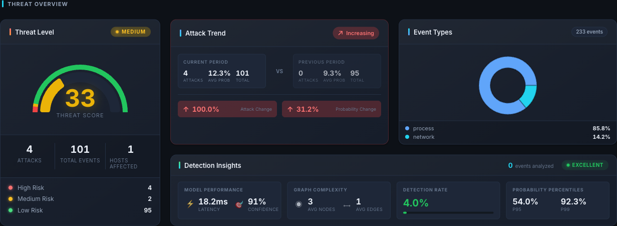
Threat Overview — composite threat score gauge, period-over-period Attack Trend (current vs previous window), Event Types donut, and Detection Insights with model latency, confidence, and P95 / P99 probability percentiles.
Reading MITRE ATT&CK TTPs
TTP IDs show up on inference records, in the alerts stream, and in
the /analytics/ttp-distribution panel. The format is always
Tnnnn[.nnn] — an MITRE ATT&CK technique or sub-technique
identifier.
When an alert carries multiple TTPs, treat them as simultaneous observations: the detection model matched all of the listed techniques in that window. Multiple TTPs are stronger evidence than a single one.
The canonical MITRE reference is https://attack.mitre.org. Look up each ID there for the full description, the detections MITRE recommends, and known mitigations.
When something on the console looks wrong
- All tiles empty, no errors. The time range has no data — widen it, or confirm that endpoints are reporting in and inferences are being produced.
errorprediction count is high. The detection model is seeing under-sized windows.- Same attack keeps re-appearing every 30 seconds. The
console shows every inference, not the deduplicated alert. For
a de-duplicated view, query the REST API
/alertsendpoint. - A host disappears. Check the time range and hostname filter — the view may have scoped it out.